Survey Visualisation using d3.js and Flask
Visualize an individual’s response to a survey compared to other people.
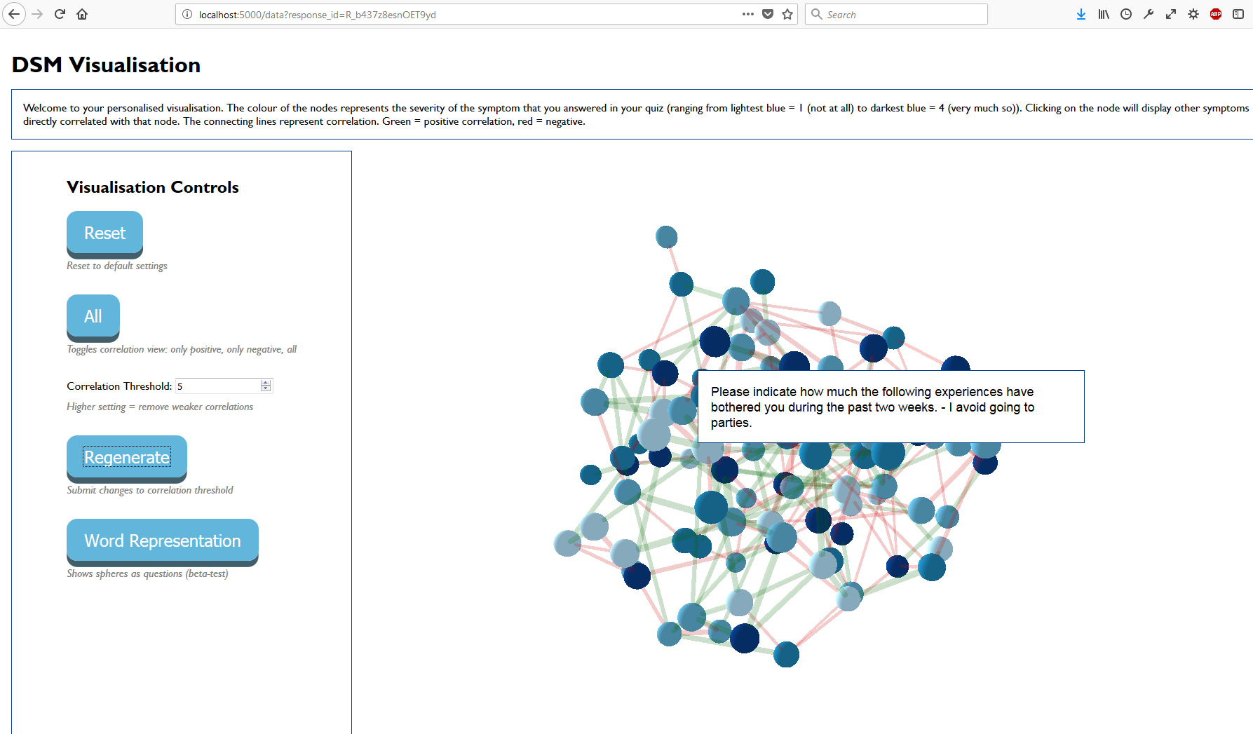
Once the user completes their Qualtrics survey, a 3D force graph is generated and embedded in an iframe.

More detail
- Node Color: Individual Question Response
-
Node Thickness: Average response to this question
- Edge Color: Green = Positive, Red = Negative
- Edge Thickness: Absolute strength of correlation, thickest = +-10, thinnest = 0
Why this was made
This was a group project completed over a week as part of the Macquarie University’s 2017 Computing Undergraduate Winter Workshop The goal was to provide a method of visually comparing the results of a individual survey to that of every other person.
More information can be found at the bitbucket repo here.
My Tasks
I handled the data processing and data cleaning. This meant taking a csv returned from a Qualtrics API call, and processing it into a format that can be read by javascript arrays into a 3D Force Graph
- Retrieve from Qualtrics API:
- All survey responses in csv format
- Individual Survey response (node colour)
- Use Python and the Pandas library to create
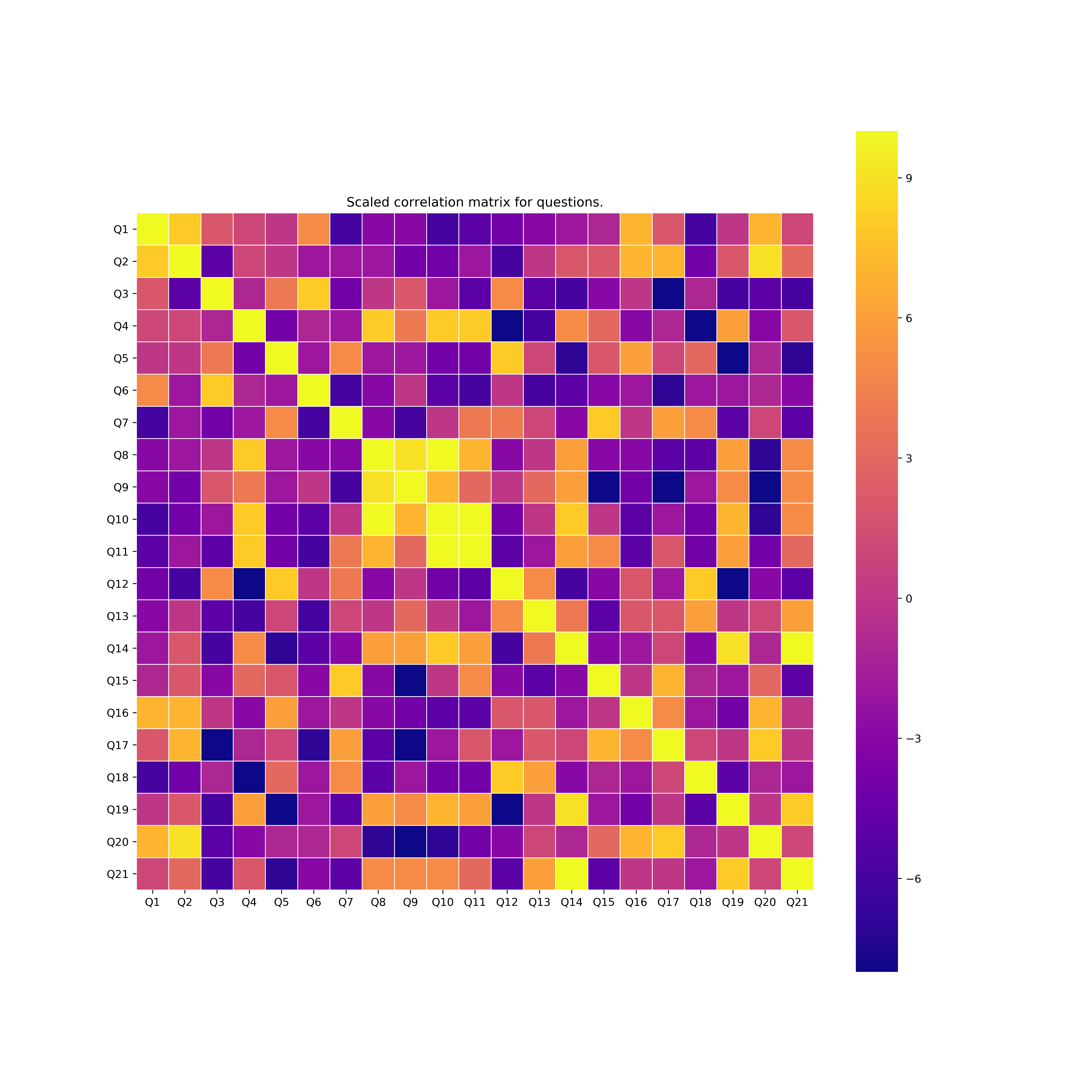
- A pearson correlation matrix between questions (edge colour + thickness)
- Had to rescale the correlation to a value between -10 and +10 for visualisation purposes.
 [^Fig. 2:]: Example pearson correlation heatmap for all demo questions.
- Had to rescale the correlation to a value between -10 and +10 for visualisation purposes.
- Calculate average response (size of node)
- Involved normalising the question responses to a 1-4 range
- e.g. if question has 6 possible answers, move into 4 baskets while assuming that all questions have ordinal answers.
- Involved normalising the question responses to a 1-4 range
- Clean the data
- Remove columns that were unnecessary for processing
- non-numerical columns also dropped
- Generalised processing for all tested Qualtrics surveys by using regex to find specific columns.
- e.g. response_id, responseid,responseID,response,_Id are the same column in different surveys
- A pearson correlation matrix between questions (edge colour + thickness)
After the data was processed, it was routed to the javascript via flask.
The visualisation is a 3D Force Graph using D3.js
The project is hosted on heroku and delivered to an embedded iframe within the survey, showing the individual results (coloured nodes) as compared to the average of the dataset.