Visualising ABS Housing Income by Suburb

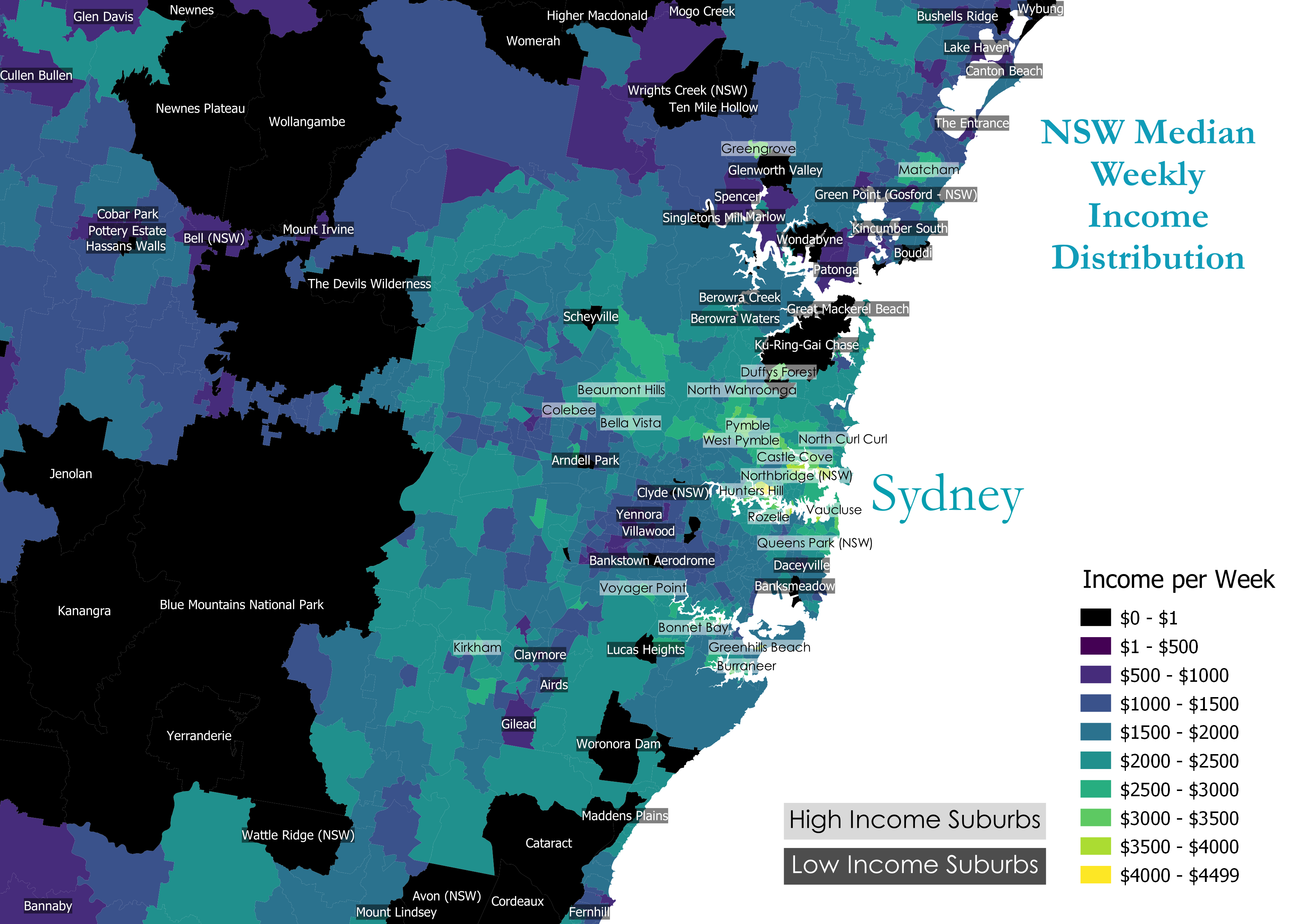
Median Weekly income distribution by NSW Suburb
About
I’ve been looking at some Australian Census data, and decided to use it as part of a QGIS project. The data is for median weekly median household income by suburb (SSC), taken from the August 2016 Census as part of a GeoPackage. The above image is located around the Sydney area.
This is a choropleth - a map that splits an area into multiple subregions, and assigns a color (or other formatting) in relation to a variable’s value.
The suburb labels that are shown are high median income (black text white background) and low median income (white text black background). I had to join the suburb names via a separate CSV, which required a basic python script to format the suburb codes the same way.
Project Goals: The goal of the project was to see if the income data backs up the intuition that income increases with proximity to city CBDs.
Also, the idea was to use QGIS understand things like ShapeFiles, rules-based labeling, and joins between attribute tables.
Colourmap / Colour Range
Decided to choose colours that:
- easy to distinguish
- easy to identify using legend
- visually appealing
Observations
- In general, there is a noticeable pattern. The suburb’s income increases as it approaches a CBD / City. My guess is that due to high costs of living close to a city you need a high income to afford it.
- The area of each suburb decreases as it approaches a CBD.
Outliers
Low Incomes
- Some areas have a weekly median income of 0. (coloured black)
- This could be the null value chosen for missing / insufficient data
- Some of these areas are national parks. There may be nobody registered as living within those areas. All areas of Australia, as far as I have seen belong to a SSC (suburb identifier).
High Incomes outside of CBDs
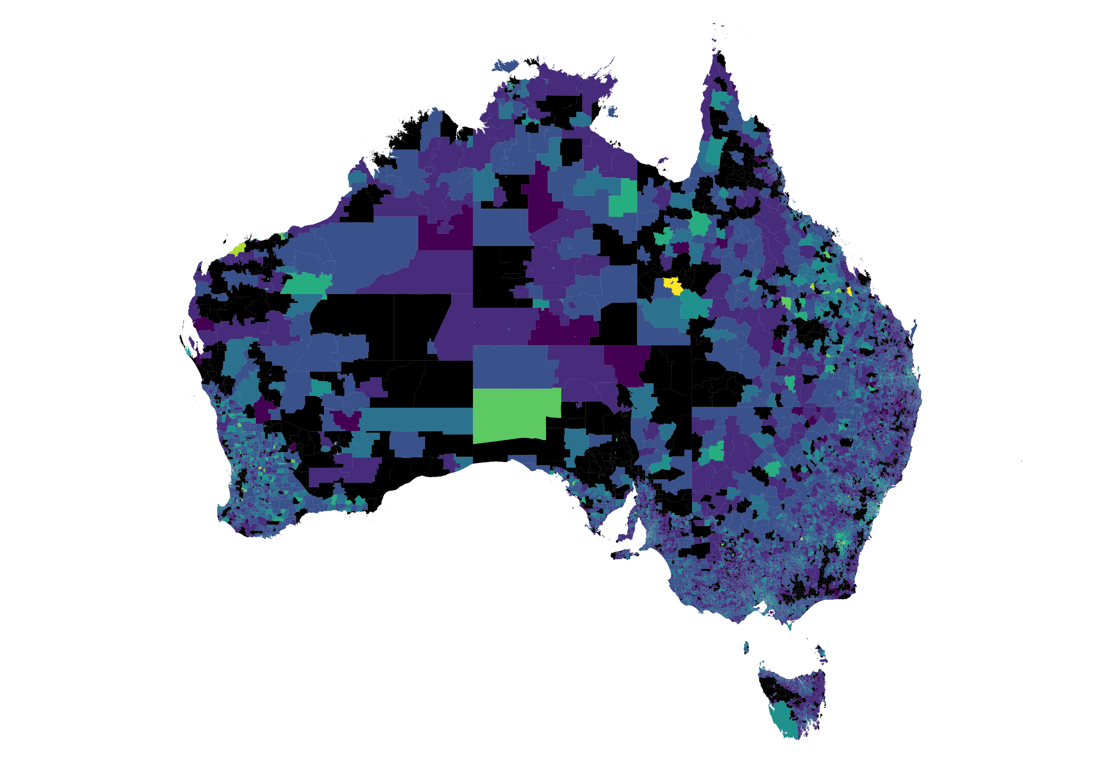
- Mining towns have a much higher income then their surrounding suburbs. In the below zoom-out of Australia, you can see there are a number of unusually high income suburbs in the middle of nowhere. These are mostly mining towns.
Wider view of all Australia

Luckily the ABS dataset had data for all of Australia. The use of black for incomes of $0 can make the map look incomplete in the centre. However that is just the result of a few giant suburb areas.