Experiment with AWS and Mode Dashboards / Reports
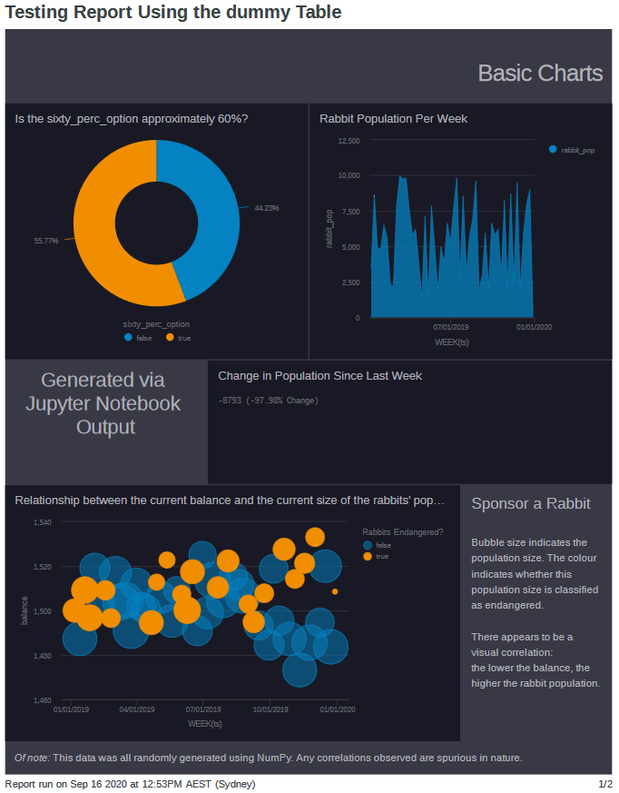
Experiment using fake data in a Mode Analytics Report (Dashboard)
Data Analysis + Visualisations

Experiment using fake data in a Mode Analytics Report (Dashboard)
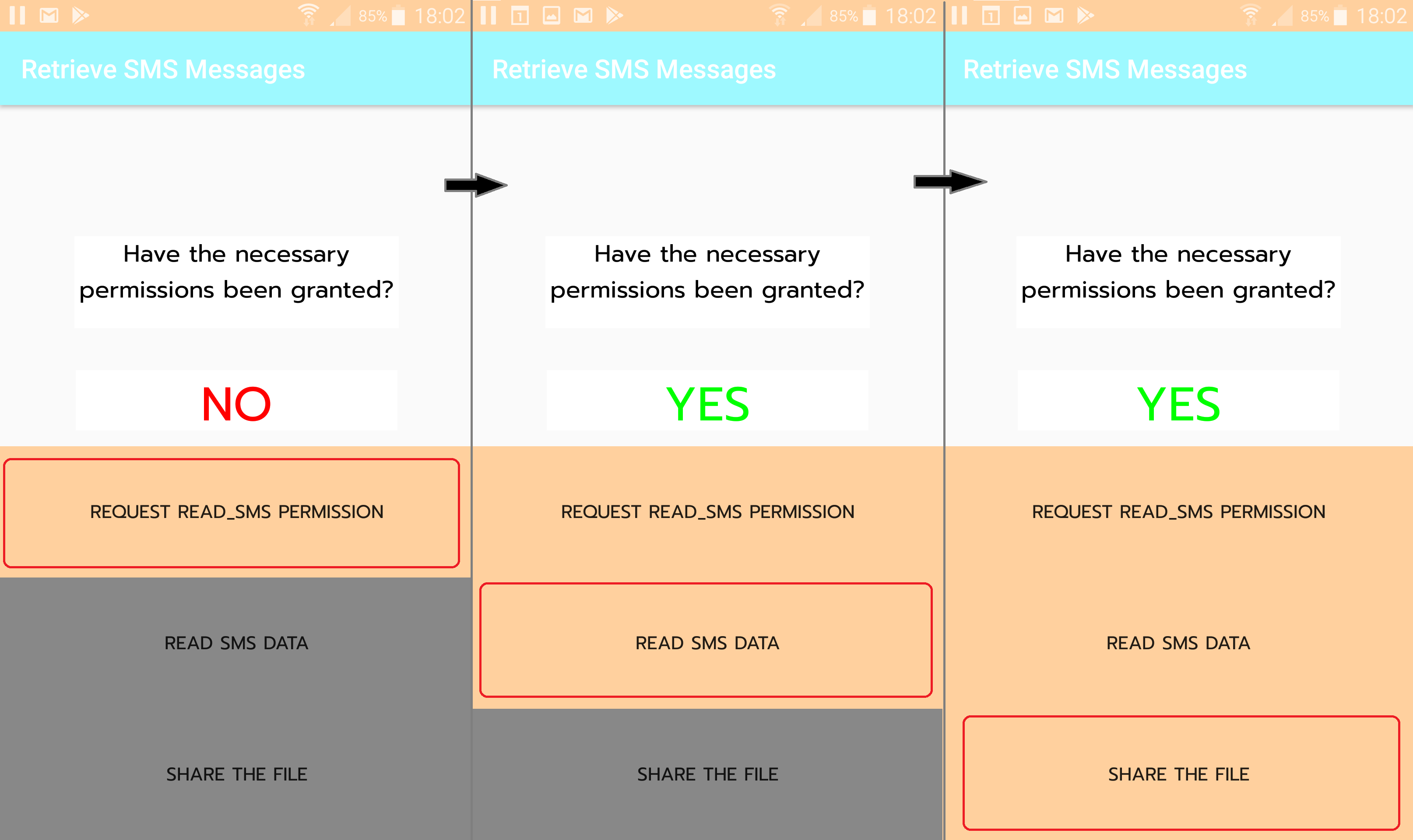
The UI design / storyboard for my Kotlin app.
I have created an app in Kotlin that extracts my SMS messages and sends them to my computer. This is part of a bigger project where I retrieve and analyse all the messages I have ever received across multiple mediums such as SMS, WhatsApp and Facebook Messenger.
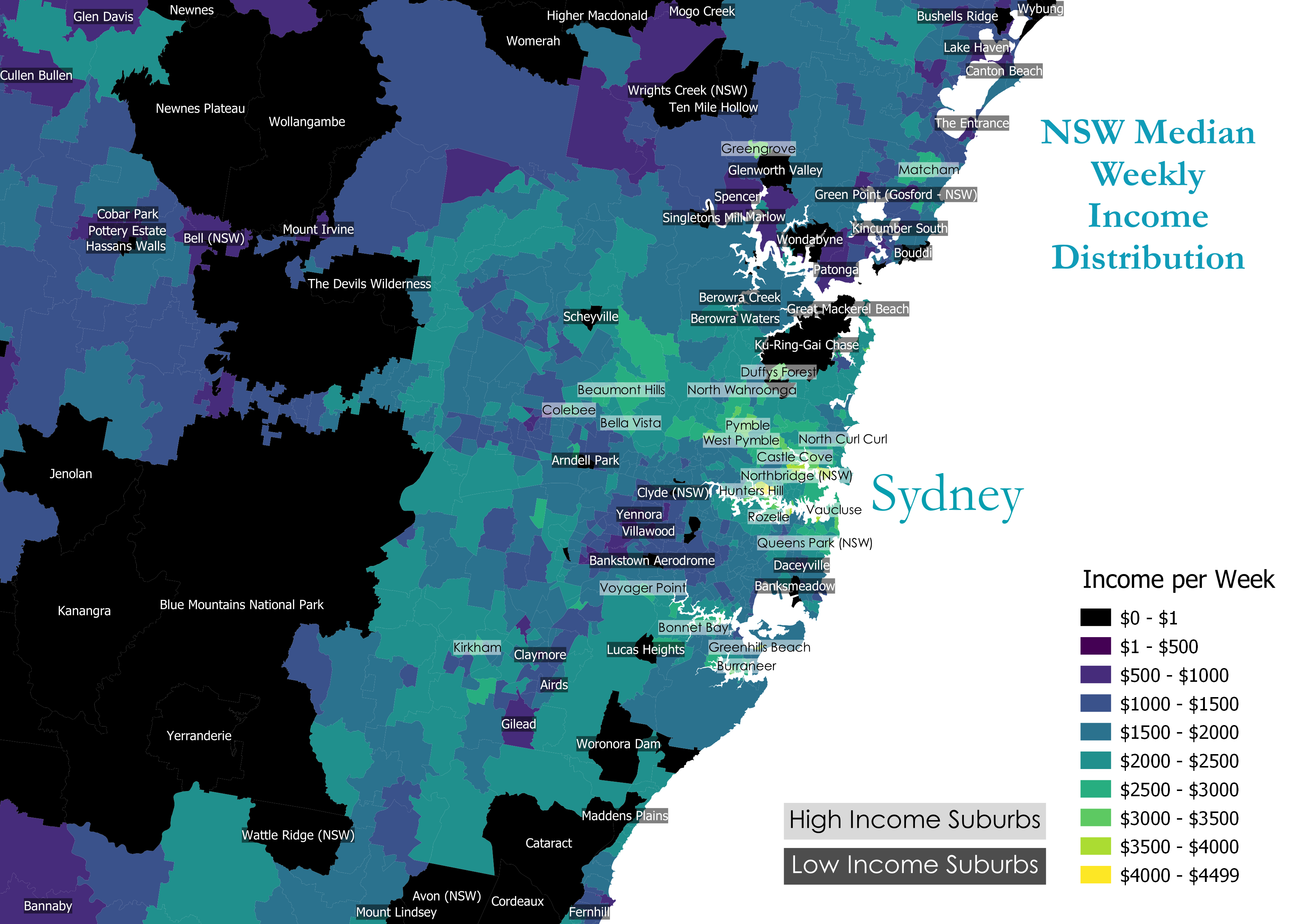
Median Weekly income distribution by NSW Suburb
Leaflet showing (past) live bus data in NSW, Australia via TfNSW API
Repetition pattern of lyrics in a Beatles song. [OC] from r/dataisbeautiful
I decided to recreate an interesting visual for song repetition by Colin Morris. The visual can be seen in this vox video, and at his site: SongSim.
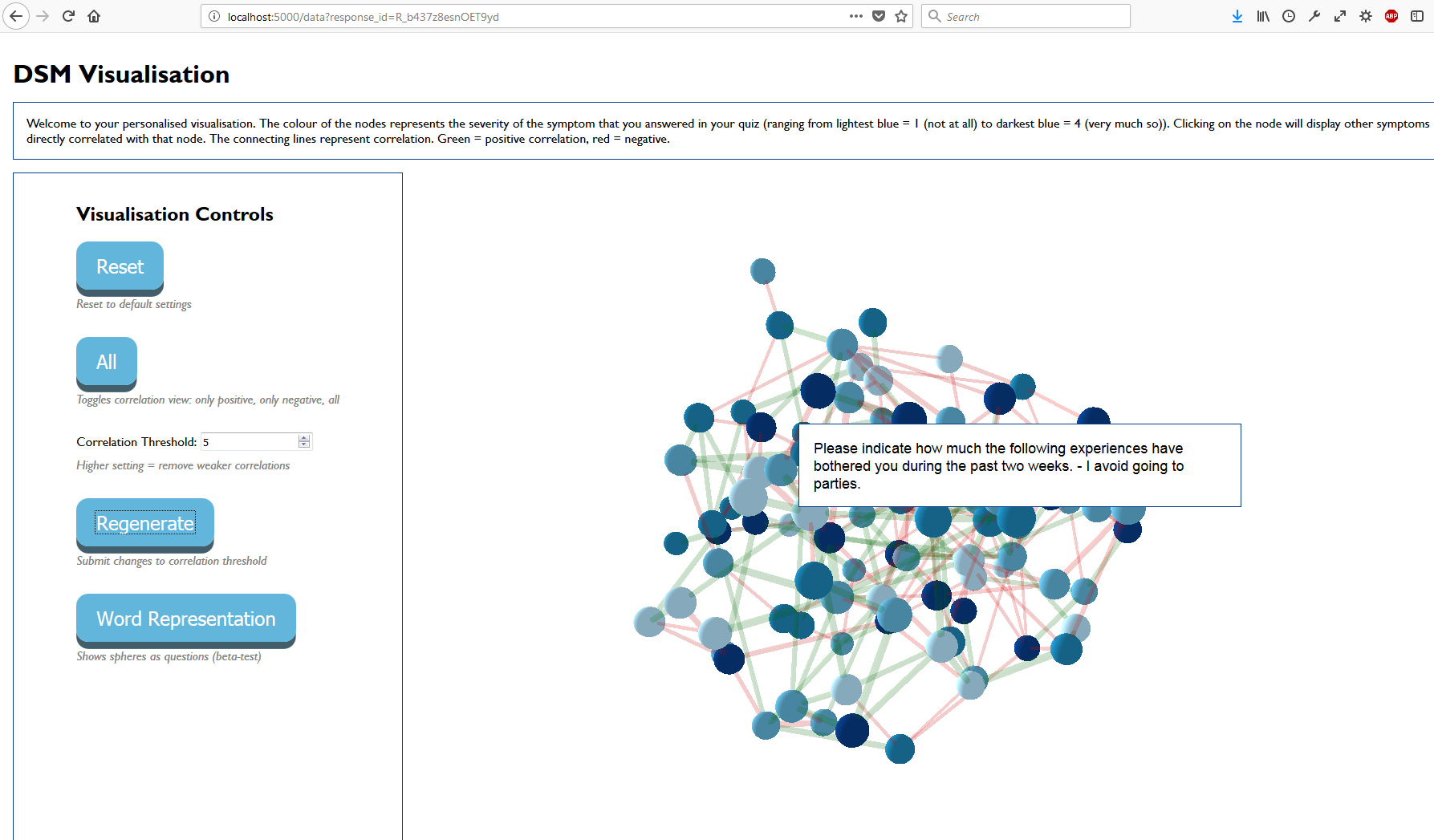
Visualize an individual’s response to a survey compared to other people.
Once the user completes their Qualtrics survey, a 3D force graph is generated and embedded in an iframe.
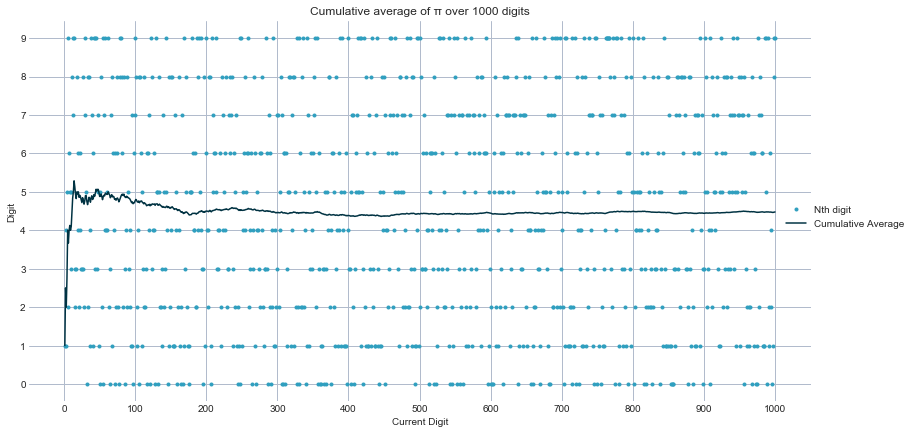
Visualising the first 1000 and 10000 digits of π, to see if there are any interesting patterns to see.
